


Why brand is important
Our brand is not our logo. It is a result of our combined effort, wherever we are in the world, to present and deliver our business with the same style and values to our audiences. This means it is more than just marketing. It is our consideration for every moment that we interact with others, be that physical or digital, in person or remotely. To achieve a stronger, more powerful brand for Infinite Global, we will continue to develop and evolve our brand, bringing you updates, tools and advice through this website.
Ultimately, we don't decide what our brand is, it is in the opinions of those who come into contact with us. We can merely try and influence it through effort and diligence.
Brands convey a uniform quality, credibility and experience. Brands are valuable.
–
Forbes
The information presented here is intended to assist you, as a representative of the Infinite Global brand, to deliver as much.
Please do let us know how we can continue to help.
The essence of our brand
Who we are
Infinite Global is an award-winning communications agency (providing PR, Branding, Crisis & Litigation and Digital services).
What we do
We help (professional services firms and other) complex businesses demonstrate their expertise to sophisticated audiences.

Our visual language
In the following sections we introduce and explain how to use the principal components of our visual identity system, which through these graphic components and consistent approach to language, seeks to represent our brand. When used in unison across our entire set of communications, this system both supports and enhances our brand proposition. It is in using our visual identity with care and consistency that we will create marketplace recognition of our brand, ultimately facilitating a visual shorthand for our value and values.
Logos
Our Logotype
Explained
Our logo (Fig. A) is the primary visual identifier for our brand, encapsulating core principles, philosophies and emotions of our organization.
The logo is constructed of two components, the symbol and the wordmark. Only when used together do these form our logo.
About our symbol
The symbol is composed of three interlocking crescent shapes, metaphors for our key service offerings of PR, Branding and Content. Collectively, as a symbol, they represent all three services, when unified, as a benefit to our clients.
In certain situations the symbol and the wordmark may be used separately but only with the prior approval of the Head of Brand.
A selection of our logos can be accessed on Dropbox here.

Fig. A
Logo versions
Primary logo
Our five-colour logo (Fig. B) is the preferred version to be used across the majority of applications.
Mono versions
When the primary logo may not be used, we have produced alternate one-colour versions in both greyscale (Fig. C) and white (Fig. D), in order to maintain contrast between our logotype and different backgrounds.
Fig. B
Fig. C
Fig. D
Logo exclusion zone
To ensure our logo retains visual prominence and optimal legibility, an area of clear space must be maintained around the logo. This distance should be equal to two times “N” (as shown left in Fig. E).

Fig. E
Logo sizing
To protect the integrity of our logo, we have an enforced minimum size (Fig. F). This ensures our logotype always reproduces with legibility and quality. There is no maximum size for the logo. This depends upon the context of the media - please seek advice if you are unsure of how to size the logo for unusual media, outside of our normal formats.
Do not use our logo below its minimum size.


Fig. F
Logo positioning
As a principle, we generally aim to center the information on our communications, including the logo (as shown in Fig. G). Where a different approach is recommended, particularly for more complex formats, this will be shown in the corresponding design work or template.
_
Only use Master artwork, assets and templates available from this Dropbox folder.
Always use our logotypes correctly.
Never alter or recreate the Infinite Global logotype or any of its individual elements. This includes stretching, recoloring, skewing or rearranging its components.

Fig. G
Working with other company logos
When working with other organizations logos, such as those shown in (Fig. H), please apply the following principles;
You must respect that a logo is the intellectual property of the organization, meaning you must request permission to use the logo from the organization's marketing department or your contact before use.
Request official artwork for the logo. This ensures we do not risk showing out of date brand assets, potentially damaging our chances in an opportunity or equally importantly as a firm who specializes in corporate reputation. In addition, this guarantees an appropriate level of quality in the final application.
Once you have received the assets, do not distort (stretch, recolor, rotate) or alter them in any way.

Fig. H
Award logos
These should be reproduced in their most recognisable form, such as full color or mono, depending upon the constraints of the media (Fig. I).
Ensure each logo is entirely legible at the actual size it will appear.
Prospect / client logo
We use prospect and client logos in a number of different ways, such as proposal documents, credentials, website and client documents.
Multiple logos presented together
Where we are demonstrating our range of clients by presenting various logos together, we should try and avoid multiple color and format clashes by presenting the logos in a uniform way.
To achieve this, where possible gather the logos in their mono version when on white or white when on a darker background (Fig. J).
Ideally, you should aim for overall visual balance across the logos through scaling the logos relative to each other. No one logo should be particularly prominent over the others.
Logos used in isolation
Where logos are being used singularly, please follow the brand guidance provided by the client or prospect. If such guidance is not readily accessible, present the logo in its most recognisable form – often full colour, at a legible size.
Mastheads / publication logos
See guidance on prospect / client logos above.

Fig. I

Fig. J
COLOR
It's unsurprising that both our industry and those of our clients are dominated by “corporate” blues. Our application of purples strategically positions us away from the crowd.
The proper use of the combination of palettes enables us to produce recognisable, yet interesting and dynamic communications, evocative of our core proposition.
These palettes have been specifically chosen to include colors which reproduce consistently well across print, digital and physical platforms. Click here for a downloadable color specification chart which provides values for the most common color reference systems, including Pantone, RGB, HEX, CMYK and RAL. Please choose the system relevant to your end usage.
Using tints of colors and transparent overlays
Each color within our palette can be applied at any level of transparency or tint percentage. The objective when applying tint or transparency is optimal legibility, alongside retaining overall recognition of our brand.
Primary color palette
When used correctly, and consistently across our communications, the Primary palette (Fig. K) serves to strengthen our brand recognition. Purple is most often culturally associated with creativity, imagination, and caring.

Fig. K
Secondary color palette
The Secondary palettes (Figs. L) have been chosen to complement our Primary palette in ways which allow us to express additional sentiments beyond our values, such as vibrancy, luxury or sophistication, depending upon the particular market, client or communication type.
Colors from the Secondary palettes should be used in sparingly, in small amounts throughout the whole communication.
Choose the secondary palette which suits your context best. For instance, if the client or market is conservative in nature, then we recommend the formal color palette.
However, our clients are increasingly younger in age and outlook, operating within businesses in new markets. We have therefore added a more vibrant color palette for these instances.
See the guidance below on color proportions for further details on how to apply color overall.

Fig. L
Color proportion
Understanding and designing for our communications to support our brand means being conscious of the overall visual impression we're leaving our audience with.
Color proportions (Fig. N) are an indicative way of looking at our communications before they are distributed, to evaluate whether or not they roughly represent our brand. In the model to the right you'll see that we are suggesting that overall you should sense that white is the predominant color, followed by the purple element of our palette. No other colors should dominate our communications, including those in the Secondary palette.
Fig. N
Typography
Typography is an essential component of the Infinite Global visual brand system, by controlling the typeface and typestyles we use in our communications, we strengthen the visual impact, recognisability and distinctiveness of our brand.
Typeface
Our primary typeface, Helvetica, is to be applied across a majority of our communications. It has been chosen for the versatility of its font families and the clarity with which it reads on any platform.
Helvetica
Helvetica is a modern, flexible and well-engineered typeface that embraces the best of Humanist and Geometric type design. As a font, Helvetica reflects the modernity of our business and the way in which we deliver our expertise for clients.
Font styles we use primarily
Helvetica has a wide range of styles within the font family. For simplicity and ease of use, we most frequently utilize three of these styles:
Light, Roman (Regular) and Bold (Fig. O)
Basic typographic principles
Your aim should be to create clean and clear communication. The approach that helps this is to keep font versions to a minimum. Use size (and where appropriate, color) to portray the order in which you would like your audience to read the type. This means, for instance, that headings should always be the largest piece of type in the communication.
Keep it neat. Keep it simple.
Typography don’ts
DO NOT use typefaces other than Helvetica in any Infinite Global communication, including your email signature.
DO NOT add effects or distortions to type, particularly drop shadow, stretching of type, or making type read vertically.

(Fig. O)
Imagery
In presenting our brand, we are principally photographic in how we apply imagery.
Photography, therefore, plays an essential role in contributing to our organisation’s identity, its vision and values, ultimately, increasing brand recognisability and recall within our target audiences.
While the subject matter and the compositions of our images project relevance, integrity, excellence and creativity, the tone and colour values evoke the personability and warmth unique to our culture.


We utilise three different, yet complementary approaches to imagery depending upon whether we are representing our Sectors and services, imagery in support of content, or in depicting our people through their corporate headshot.
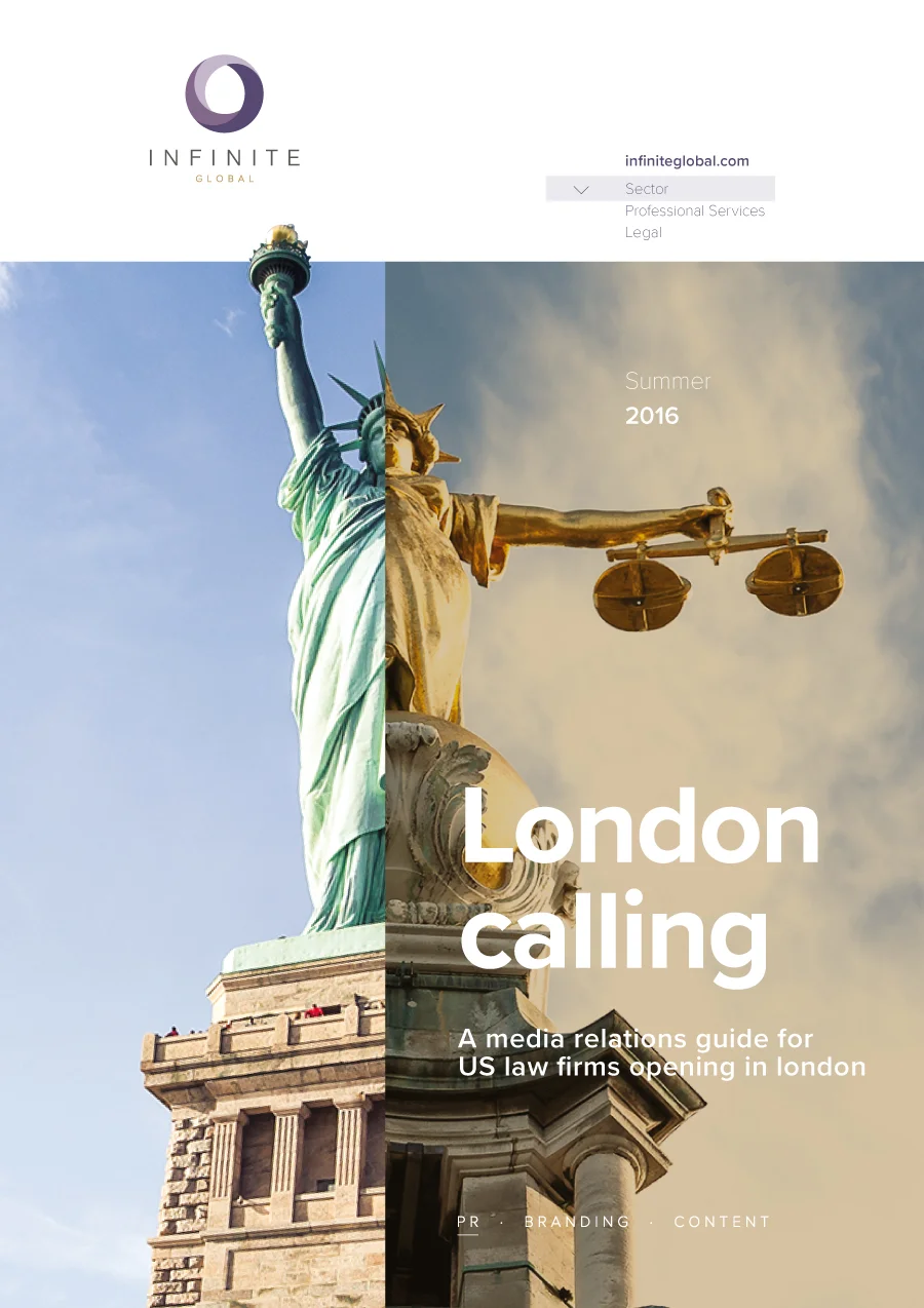
Portraying our sectors and services
Our Sector and Services photography can contain a range of different subjects, including urban architecture, rural landscapes, and objects.
The hands-on, intimate quality of our images illustrate the “application” of our brand values. The breadth of our images from analogue to digital (piano/sewing machine vs Apple watch/CD drive) showcase our strengths of contemporary awareness and understanding, enhanced by an emphasis for craft in delivery.
Subject matter
Our brand imagery should be credible and convincing – avoid overly contrived concepts and stock clichés (those images that are seemingly on every professional services firms website – handshakes, lighthouses, business meetings, etc.)
As prompts for subject matter, consider any of the following;
Implements. Many of our images contain implements or tools, such as typewriter keys, .... . Is there an implement past, present or future which might represent your topic?
Environments. Use of environments can be particularly effective where they are synonymous with a particular type of industry or business.
Metaphors. Spices, bees and other subjects can be effective visual metaphors, invoking a sense of purpose to our communications.
Style
Our Sectors and Services imagery style is defined by three characteristics:
1. A shallowness of focus in the image. Where the important part of the image is in focus, yet the elements of the foreground and background might be blurred.
2. Warmth of tone. By being tonally warm, images more accurately reflect our own human warmth. Demonstrated in the way in which we treat each other and our clients. Cool and cold imagery tends to project a more clinical and isolated approach.
3. A sense of context. Images should not be overtly abstract and devoid of background information (eg. white background). Seeing the subject in context helps the reader understand the role of the subject in the environment.
TIP: Super close-ups of subjects help to abstract an image, revealing the detail within the subject that align with our vision and values.
Never use cartoons or hand-drawn illustrations without prior approval.


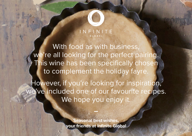
Choosing content imagery for blogs and articles
Images used outside of sector and services, such as the everyday needs of blogs or articles, requires a different style of imagery. One that is more relevant to the content or concept. To achieve this we have devised the following primary approaches:
Style – the 'language of circles'
As we've already discussed, the circular symbol within our logo represents concepts of whole, holistic, and focus.
These characteristics can also be echoed visually through our content imagery, utilizing circles in different ways. The use of the circle graphically reinforces our brand, meaning the more we use it, the more we are instantly recognised through it. Of course, circles are not the only part of our brand, but when used in combination with our font and colour palette, our brand becomes infinitely more recognisable.
Shown are just a few of the ways to date in which circles have be applied to content imagery.
Subject matter
When sourcing an image for a piece of content, ask yourself "Can I think of a circular way of visually representing my content?"
The subject matter might represent how your target reader feels. For instance, "I feel exposed to risk", could mean using an image a life-preserver as a circular object. This is both appropriate in reflecting our brand, yet meaningful to our audience as a metaphor for rescue or safety.
Alternatively, is there a new cyclical view of a more normal object? For instance, from above, or a circular detail to an object such as firework leaving a circular trail as it is used, representing the idea of celebration.
Whilst the use of circles is our preferred route, sometimes this approach just isn't appropriate, or achievable. In these instances an image which is content relevant but uses applied devices, such as circular graphics will still help reinforce the brand.
See the examples shown for inspiration on how to use circles with images. You can also visit our lightbox on Shutterstock, for more inspiration and options.


Images of us
Our portraiture is less formal than traditional corporate headshots. Reflecting our values, our subjects are relaxed, engaged and approachable. Portraits are shot outdoors, near our office spaces, so to provide a sense of place of business.
The background and space around the subject heavily influences how the portrait is framed. Each individual location offers an opportunity to frame the portrait with its own particular culture and character. The location should not dictate nor define the particular type of shot, but enhance the idea that the subject is at ease in the space.
Contact the Brand team for details of your nearest approved portrait photographer.


Tone of voice
In writing, our goal is to maintain the firm’s brand by ensuring consistent voice and appropriate tone. These guidelines should help ensure that voice and tone, as well as spelling, grammar and style, remain reasonably consistent from one piece of content to the next — even when the content is written by various authors.
Reflect Infinite Global attributes and values
The way we write should reflect our company attributes, values and personality, especially:
| Attributes | Values | Personality |
|---|---|---|
| Creative | Honest/Integrity | Curious |
| Approachable | Professionalism | Professional |
| Global | Responsibility | Engaged |
| Smart | Responsiveness | Caring |
Wherever possible, our language should be lean and precise, cordial and professional. Try not to be overly formal or inappropriately casual, and always avoid unnecessary jargon.

Get to the point
Less is more. Avoid overly long constructions that require the reader to spend inordinate time deducing the point or action required. Get to the point quickly and elaborate as necessary. Efficiency demonstrates our respect for our readers’ time.

Vary structure for comprehension and interest
Err on the side of short, simple sentences and short paragraphs, but keep the syntax — don’t strip it back so far that is little more than bullet points or lists. Properly constructed sentences are better for SEO, and more readily understood in presentations. Still, keep it interesting by using a mix of sentence structures and lengths.

Make smart word choices
Aspire to be simply smart. Don’t use a long word when a shorter one will do. Don’t use foreign (including Latin) words or phrases if an everyday English equivalent is available. And avoid repeated words close together within a paragraph — especially verbs.
When writing accompanies graphical elements, make sure they complement each other. Don’t write what is visually obvious; use the language to add context or analysis.
Use active voice
Always use the active voice, and use active verbs whenever possible (“doing” words not “being” words). Where possible, write in the present tense.

Address your audience(s)
Avoid blanket usage of “you” in marketing and business development presentations. Infinite Global serves many distinct client categories, so saying “we can help you” takes a lot for granted about the reader. Instead, consider the specific audience, whether legal, property, corporate or other, and address the audience with as much specificity as possible. Or, simply refer to “our clients.”
Where possible, refer to Infinite Global using the firm name. When necessary for variety use “we.”

When referring to people, use preferred first name on second reference, and avoid courtesy titles.

Be culturally sensitive
When writing for a global audience, avoid metaphors, similes, figures of speech or culturally specific references that will not be widely understood.
We no longer have American and British English versions of our website, so where possible avoid those phrases and words that will confuse or annoy those on the other side of the Atlantic. If you are unsure, check with colleagues. For local market correspondence, however, use local spelling conventions and idioms.
Get help
These principles are intended as broad guidance, and exceptions will arise. When in doubt, consult the Brand or Content teams, or refer to our more comprehensive Writing Style Guide, which can be found here: Dropbox (Infinite Global)\Knowledge-Center\Reference.
Charts, icons and other graphics
Charts, icons and other graphics is a complex and wide-ranging category. When approaching the creation of these we promote the following principles, as demonstrated in the examples shown.
1. Avoid 3D. Our graphics are two-dimensional. This means the avoidance of overly fussy treatments, such as drop shadows or 3D shapes such as cylinders, cubes or pyramids.
2. Lightness & delicacy. Transparency and a lightness of line portray a lightness and delicacy to our graphics. We should avoid any graphic looking heavy and cumbersome.
3. Simplify. Strip away any unnecessary information or graphics. Similarly ensure all labels and language is clear.
A package of our most frequently used graphics is available to download from DropBox here.


Standards
As much as we value an idea or concept, we must ensure that it's delivery is equally considered in how it portrays our brand.
Below we have approached how we achieve the right impression through consistent use of paper stock, digital communications, and the outputs from Microsoft Office products such as Powerpoint and Word.
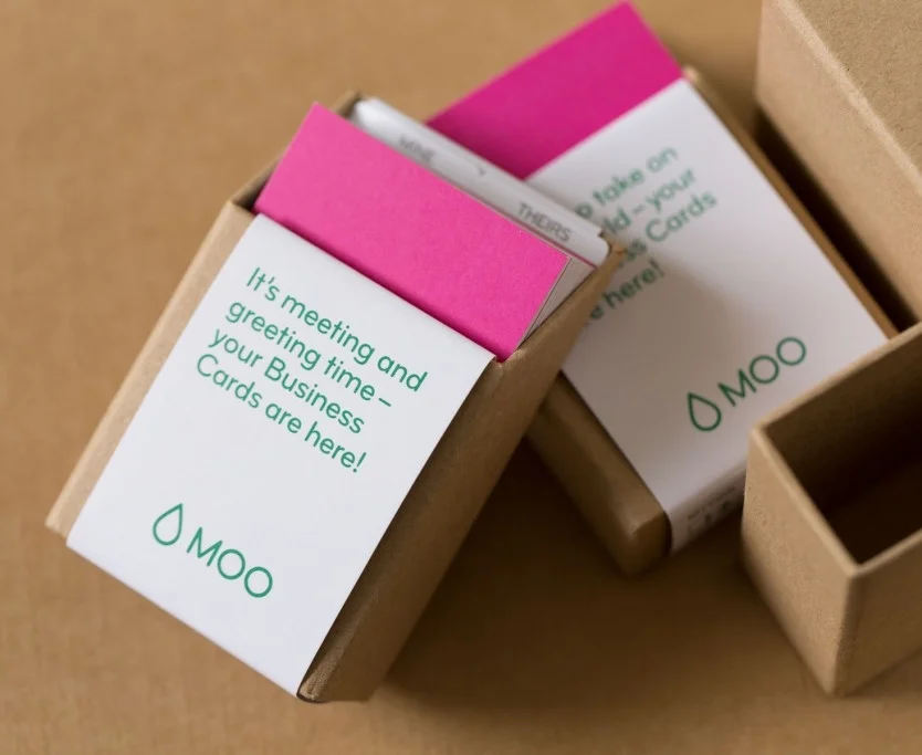
Paper
As a brand that seeks to inspire a sense of sophistication to
a sophisticated audience, choosing a paper stock that is both evocative of our values, yet also available across the globe, particularly the UK and USA, has been an important decision.
The paper stock we have chosen to represent our brand is Colorplan by G.F. Smith. The weight and texture of this iconic paper exemplifies exquisite handcrafted, refinement.
This paper is used as a 'brand wrapper' to our standard office copier stock, adding tactility and brand value.
We use two colors from the Colorplan range;
For purple
Colorplan Amethyst (UK) 270-350gsm or (US) 80 -130lbs. Bold, vibrant and energetic this particular shade of purple, closely matches our Infinite Global Purple.
We use this paper in instances such as presentation front and back covers, and corporate folders.
For white
Colorplan Pristine White (UK) 135-350gsm or (US) 32 -50lbs. The weight, subtlety, warmth of tone and toothy texture commands attention invites physical engagement.
We use this paper in instances such as business cards, letterheads, envelopes and greetings cards.
Colorplan Amethyst
Colorplan Pristine White
Digital
We believe it should go without saying that when it comes to digital interactions, the following simple principles should be remembered:
Aim for intuition. Use universal standards, don't fight them. Universal standards mean that the end user already has an expectation when they see these and don't have to learn a new visual vernacular. The more they have to learn about how our platforms work, the less likely they are to stay.
Digital communications are two-way. Expect a response, or even encourage one. Even if you are not looking for a response, most platforms allow for one, so consider how your message could be interpreted.
Be timely. Set up alerts so that we can acknowledge and respond quickly to opportunities to sustain an online conversation.
Remember the brand. Everything you post impacts others perceptions of our brand. If you are unsure, don't post it – seek advice first.
Presentations
Presentations are NOT proposals. Presentations are instances where a speaker is standing in front of, and narrating information to an audience. Presentation slides provide the backdrop to this narration. The following tips on building presentations were taken as an extract from this LinkedIn Learning post on best practice presentations: linkedin.com/learning/content-marketing-slides
1. Keep your slides consistent.
Having one style for one slide and then a different style for a different slide can be jarring to the audience. One consistent tone makes the presentation flow much better. Use our branded template for your decks.
2. Keep it text light and make it visual.
Nothing makes peoples’ eyes glaze over faster than a text-heavy slide, or slide after slide of just text. Use images, charts, graphs, videos or anything else visual to break up the monotony of words. It’ll also add emotion to your presentation.
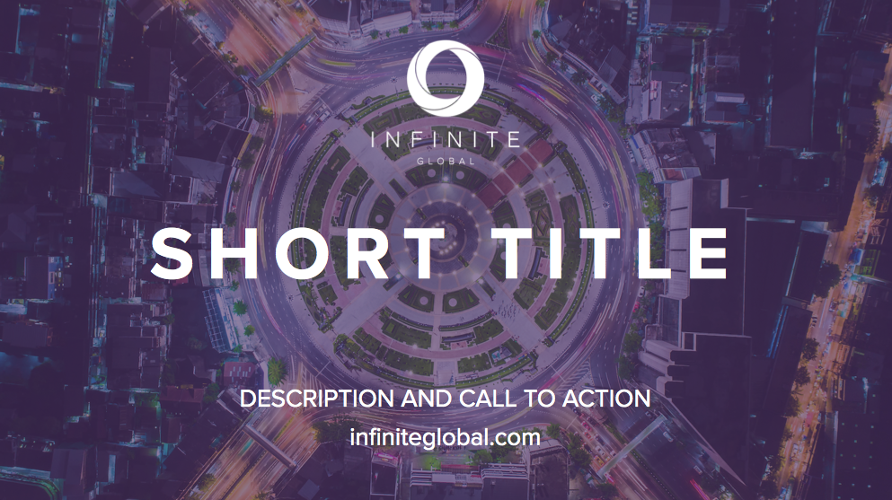
3. Make your title slide stand out.
This is particularly important if you are using your slide deck as a marketing asset for email, social media or any other channel. But, even if it is internal, you want to have a title slide that stands out.
What does that mean? It means having a visually engaging title page and an enticing title that draws people in.
4. Show, don’t tell.
Wherever you can, don’t simply speak to problems. For example, if you were doing slides on a new product or new webpage, don’t simply describe it.
Instead, a far more effective deck would highlight the product or webpage and show off its important features. Along with being more visually stunning, it’ll increase your audience's understanding of exactly what you are trying to accomplish.
5. Have your slides tell a continuous story.
The absolutely most engaging slide presentations tell a continuous story, where the audience becomes curious about what’s coming next. While highly effective for stand-alone presentations used in marketing, it’s also a great technique to use for internal presentations with a speaker.
The takeaway
Creating great slides is similar to creating any great content. It’s about making it easy-to-digest and visually appealing while telling a compelling story.
Our Infinite Global branded presentation template is available here.
Examples of our brand in action
Here are just a few examples of our brand in action. Specifically chosen to reflect the distinctive and sophisticated style achievable through the combination of these few components, these items exemplify our branded communications at their best.


Contact information
We're here to help.
If you have a question for our support page, or suggestion regarding how to use our brand, please contact us.
